← Projects


Supply Chain & Inventory Performance Analytics
This repository provides a comprehensive end-to-end analysis of supply chain operations, focusing on inventory optimization, logistics efficiency, and supplier performance. The project utilizes…
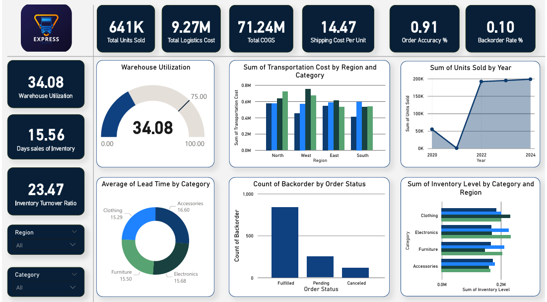
This repository provides a comprehensive end-to-end analysis of supply chain operations, focusing on inventory optimization, logistics efficiency, and supplier performance. The project utilizes Python for feature engineering, SQL for data extraction, and Power BI for executive-level dashboarding.
📊 Business KPIs Tracked
- Inventory Turnover: Measuring how efficiently inventory is sold and replaced.
- Warehouse Utilization %: Identifying overcapacity or underutilized storage space.
- Backorder Risk: Highlighting regions and categories prone to stockouts.
- Shipping Cost per Unit: Evaluating logistics efficiency by region and category.
- Supplier Accuracy & Lead Time: Rating suppliers based on reliability and speed.
🗂️ Project Structure
FE.ipynb: Python notebook containing Feature Engineering and KPI calculations using Pandas and NumPy.SQL_Queries/: A collection of scripts for deep-dive analysis:BackorderRiskAnalysis.sql: Identifies high-risk regions for stockouts.InventoryTurnover.sql: Calculates financial efficiency metrics.Logistics&ShippingCostEfficiency.sql: Analyzes transportation cost impact.WarehouseCapacity&Utilization.sql: Monitors storage health.supplier_performance.sql: Tracks vendor reliability metrics.
Inventory_SupplyChain_Dataset.csv: The primary dataset containing 1,200 records of regional supply chain data.
🛠️ Technology Stack
- Data Processing: Python (Pandas, NumPy)
- Database Querying: SQL (T-SQL/Standard SQL)
- Visualization: Power BI, Matplotlib, Seaborn
- Environment: Jupyter Notebook
📈 Key Insights from Analysis
- Stock Status Logic: Inventory is automatically flagged into three categories: Optimal, High Risk (over 80% utilization), and Critical Low (under 20% utilization) to assist in proactive restocking.
- Logistics Efficiency: Detailed breakdown of shipping costs per unit sold, allowing for regional cost-optimization strategies.
- Supplier Reliability: Calculation of an “Accuracy Rate %” and “Average Lead Time” per supplier to aid in procurement decision-making.
🚀 How to Use
- Data Prep: Run
FE.ipynbto generate the engineered features and KPIs. - Analysis: Execute the SQL scripts against the processed dataset to generate summary tables.
- Visualization: Import the dataset into Power BI to view the interactive dashboard.
Developed as a tool for Supply Chain Managers and Data Analysts to drive data-driven inventory decisions.
Notebook
import pandas as pd
import numpy as np
import matplotlib.pyplot as plt
import seaborn as sns# Load dataset
df = pd.read_csv('Inventory_SupplyChain_Dataset.csv')df.head()| Date | Region | Category | Supplier | Warehouse | Order Status | Units Sold | Inventory Level | Transportation Cost | Order Accuracy | Lead Time (Days) | Backorder | Cost of Goods Sold (COGS) | Average Inventory | Warehouse Capacity | |
|---|---|---|---|---|---|---|---|---|---|---|---|---|---|---|---|
| 0 | 14-01-2020 | North | Accessories | Supplier A | Warehouse 1 | Fulfilled | 302 | 2124 | 1103.838324 | True | 9 | False | 37820.05240 | 2048.0 | 5037 |
| 1 | 15-11-2020 | East | Furniture | Supplier D | Warehouse 2 | Fulfilled | 741 | 1972 | 13163.007660 | True | 11 | False | 54396.17369 | 1213.0 | 9216 |
| 2 | 16-04-2020 | East | Furniture | Supplier C | Warehouse 2 | Fulfilled | 940 | 454 | 9872.294126 | True | 17 | False | 24217.45462 | 1160.5 | 7699 |
| 3 | 17-04-2020 | South | Accessories | Supplier D | Warehouse 2 | Canceled | 589 | 1867 | 4547.589932 | True | 3 | False | 38919.08005 | 3364.5 | 9271 |
| 4 | 18-04-2020 | North | Accessories | Supplier C | Warehouse 2 | Fulfilled | 964 | 4862 | 11994.042310 | True | 21 | False | 59204.50683 | 3063.0 | 5828 |
df.info()<class 'pandas.core.frame.DataFrame'> RangeIndex: 1200 entries, 0 to 1199 Data columns (total 15 columns): # Column Non-Null Count Dtype --- ------ -------------- ----- 0 Date 1200 non-null object 1 Region 1200 non-null object 2 Category 1200 non-null object 3 Supplier 1200 non-null object 4 Warehouse 1200 non-null object 5 Order Status 1200 non-null object 6 Units Sold 1200 non-null int64 7 Inventory Level 1200 non-null int64 8 Transportation Cost 1200 non-null float64 9 Order Accuracy 1200 non-null bool 10 Lead Time (Days) 1200 non-null int64 11 Backorder 1200 non-null bool 12 Cost of Goods Sold (COGS) 1200 non-null float64 13 Average Inventory 1200 non-null float64 14 Warehouse Capacity 1200 non-null int64 dtypes: bool(2), float64(3), int64(4), object(6) memory usage: 124.3+ KB
df.describe()| Units Sold | Inventory Level | Transportation Cost | Lead Time (Days) | Cost of Goods Sold (COGS) | Average Inventory | Warehouse Capacity | |
|---|---|---|---|---|---|---|---|
| count | 1200.000000 | 1200.000000 | 1200.000000 | 1200.000000 | 1200.000000 | 1200.000000 | 1200.000000 |
| mean | 533.892500 | 2530.473333 | 7723.518494 | 15.739167 | 59370.480017 | 2529.588333 | 7425.831667 |
| std | 275.469524 | 1416.945265 | 4202.727652 | 8.442187 | 44542.532052 | 1000.512796 | 1460.827133 |
| min | 50.000000 | 101.000000 | 509.098991 | 1.000000 | 1415.613541 | 235.000000 | 5002.000000 |
| 25% | 298.000000 | 1261.750000 | 4145.882050 | 8.000000 | 22982.367025 | 1843.000000 | 6116.500000 |
| 50% | 529.000000 | 2623.500000 | 7759.647979 | 16.000000 | 47773.376750 | 2496.500000 | 7427.000000 |
| 75% | 777.000000 | 3726.250000 | 11154.018832 | 23.000000 | 88006.544317 | 3240.125000 | 8662.250000 |
| max | 999.000000 | 4999.000000 | 14997.814050 | 29.000000 | 190841.495400 | 4863.500000 | 9995.000000 |
# Check for missing values
df.isnull().sum()Date 0 Region 0 Category 0 Supplier 0 Warehouse 0 Order Status 0 Units Sold 0 Inventory Level 0 Transportation Cost 0 Order Accuracy 0 Lead Time (Days) 0 Backorder 0 Cost of Goods Sold (COGS) 0 Average Inventory 0 Warehouse Capacity 0 dtype: int64
# Convert Date to datetime format
df['Date'] = pd.to_datetime(df['Date'], dayfirst=True)sns.set_theme(style="whitegrid")# --- Monthly Units Sold Trend ---
plt.figure(figsize=(12, 6))
monthly_sales = df.groupby(df['Date'].dt.to_period('M'))['Units Sold'].sum()
monthly_sales.index = monthly_sales.index.to_timestamp()
plt.plot(monthly_sales.index, monthly_sales.values, marker='o', color='#2E86C1', linewidth=2)
plt.title('Supply Chain Demand: Monthly Units Sold Trend', fontsize=15)
plt.xlabel('Timeline', fontsize=12)
plt.ylabel('Total Units Sold', fontsize=12)
plt.grid(True, linestyle='--', alpha=0.7)
plt.show()# --- Correlation Heatmap ---
# Helps identify which factors drive transportation costs or lead times
plt.figure(figsize=(10, 8))
numeric_cols = df.select_dtypes(include=[np.number]).columns
corr = df[numeric_cols].corr()
sns.heatmap(corr, annot=True, cmap='RdYlGn', fmt=".2f", linewidths=0.5)
plt.title('Correlation Matrix of Supply Chain Metrics', fontsize=15)
plt.show()# --- Warehouse Utilization by Region ---
df['Warehouse_Utilization'] = df['Inventory_Level'] / df['Warehouse_Capacity']
sns.boxplot(data=df, x='Region', y='Warehouse_Utilization', hue='Region', palette='Set2')
plt.axhline(0.8, color='red', linestyle='--', label='Overstock Threshold (80%)')
plt.title('Warehouse Utilization Distribution by Region', fontsize=15)
plt.ylabel('Utilization Rate (Inventory / Capacity)')
plt.legend(loc='upper right')
plt.show()# --- Supplier Performance Scatter Plot ---
# Comparing Lead Time vs. Order Accuracy to find the best partners
supplier_perf = df.groupby('Supplier').agg({
'Lead Time (Days)': 'mean',
'Order Accuracy': 'mean'
}).reset_index()
plt.figure(figsize=(10, 6))
sns.scatterplot(data=supplier_perf, x='Lead Time (Days)', y='Order Accuracy',
hue='Supplier', s=300, palette='viridis', edgecolor='black')
plt.title('Supplier Reliability: Lead Time vs. Accuracy', fontsize=15)
plt.ylabel('Average Order Accuracy (%)')
plt.xlabel('Average Lead Time (Days)')
plt.show()Want an analysis like this?
Book a 20-minute call and tell me about the data and the decision behind it.